![]()
|
|
|
| Thu Oct 7, 1999 - 2:54 PM EDT - By Marcus Adolfsson | |
|
|
|
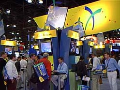
Internet World 1999 was the first chance for the public to see the Visor and its support accessories in person. Here are our opinions and impressions:
The Visor Itself
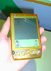
VISOR COLORS
Mike: You really should see the colors in person before deciding and buying. No website, no photo can capture them. All of the translucent
colors look like toys! These should be called "Palmboys," for they look
like Gameboys! I was severely disappointed by this, because I was planning
to buy an Orange one. The only color that looks mature is "Graphite" --
which is a dark, matte black. To use an immature image, I call it "Batman
Black," because it has the light-sucking quality of Michael Keatons costume
in the original movie. It is nice; it is masculine; you would not be
ashamed to show this in public. I cannot say the same for the other colors,
unfortunately.
Of the rest of them, only the "Green" is interesting, sea-green-like; but I think the others are just childish. Sorry! As for the translucent Visors being color on its face, backed by "Ice," I now understand the reason. Except for the "Graphite" Visor, all of the docking stations are "Ice" colored! ("Graphite," of course, has a "Graphite" dock.)
Marcus: I agree with Mike here. The translucent colors have a Color Gameboy style to them, but we need to remember which market they are for - low to mid end consumers. Many college/high school students would probably want translucent Visor, while business people will go for the stylish graphite. VisorCentral reader David Levin, who also visited Internet World, stated that "They didnt come off as Gameboy-ish to me. I thought the colors were a nice change from standard black/grey. And no, Im not a kid/student."
 VISOR FEEL
Mike:
The Visor feels quite different in the hand than a Palm III. Although it is not much thinner, it feels very thin. Although not much
longer than a Palm III, it sticks out of a shirt pocket more (at least my
shirt pocket!). The metal application buttons both look and feel smaller to
the touch. But they have a very solid feel and there is no mistaking
touching one of them; your finger absolutely feels the button. They have a
snap to them and feel like they can take a lot of impacts. Although -- when
compared to a Palm III -- they feel as if they "jut out" from the case, rest
assured that these buttons will not accidentally activate in a shirt pocket!
The ridges on the side of the Visor case are necessary, given the need to
pull out/push in Springboards without the unit slipping out of ones hands
and to the floor.
Marcus: Mike is right - the Visor feels VERY thin. Not as thin as a Palm V, but almost. The unit feels solid and the application buttons seems to work great.
Copyright ©1999-2016 Smartphone Experts. All rights reserved :
Terms of Use : Privacy Policy
VisorCentral is not not affiliated with or endorsed by Handspring Inc in any way.