The Visor Edge's hardware buttons are a shiny metallic silver color
and are convex, unlike the concave buttons on the other Visors. This
would have been a problem if the buttons (except for up/down) weren't recessed.
This makes the buttons feel concave and thus easier to press.
Another nice thing about the buttons is that the application buttons
have their symbols engraved into them instead of using paint which can
rub off. The silk-screen buttons are unchanged.
 The
translucent power button has been redesigned to perform double duty.
When the Visor Edge is charging, the power button blinks neon green as
an indicator and stays solid when fully charged. You can also use
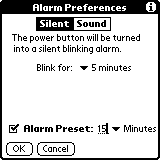
the blinking light as a silent alarm for DateBook appointments. Go
into a daily calendar view and select Options | Alarm
Preferences.
Here you can switch between the usual alarm alert sounds and a new silent
option. Set the silent alarm to blink from 1-15 minutes and never
bother others again. The blinking is visible even when the Visor
Edge's cover is closed. This is a pretty nifty option that I'm sure
we'll see on all future Visor models.
The cradle
 The
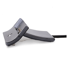
Visor Edge uses a twelve pin connector that is incompatible with other
Visor models. The Edge slides securely into the recharging cradle
by using the grooves on the sides of the Edge. An A/C Adapter plugs
into the USB connector in the same manner as the Visor Prism. In
fact, I was able to use the A/C adapter from my Visor Prism to recharge
the Visor Edge. Handspring says that it takes 90 minutes to fully
recharge a drained battery. It seemed to me that recharging the Visor
Edge was much faster than the Visor Prism.
For those that synchronize using the Ir port, it has been moved further
down the left side of the Visor Edge. I can only imagine that this
is because of the internal circuitry of the Visor Edge. Right-handed
users may find it necessary to hold the Edge differently when beaming to
another user as the left palm covers the Ir port when I hold it.
Fast Lookup
 I
have always felt that the AddressBook was the core application that needed
an update the most. Handspring has breathed new life into AddressBook
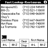
by adding the Fast Lookup feature. Press the Up button to activate
Fast Lookup, then use the Visor's hardware buttons to type in the person's
name. Just imagine typing in a name like on the telephone but with
fewer buttons:
DateBook = Last name A-L
AddressBook = Last name M-Z
ToDo List = First name A-L
Memo Pad = First name M-Z
As you're typing in a name, if you see the person's name on screen
press the Down button to scroll to the correct name then press the AddressBook
button to open the entry. It sounds complicated on paper but in practice
is very easy to work.
What makes Fast Lookup nice is that you don't need to use the stylus
to open an address book entry. I turned off the option to remember
the last category so AddressBook defaults to showing all entries.
If you don't want to use Fast Lookup you can turn it off under Options
| Preferences.
A familiar look >>